Airties Brand Refresh

The Challenge
Airties had undergone a rebranding shortly before my arrival, but without dedicated design ownership, the execution was fragmented and inconsistent. The brand lacked a cohesive visual language, accessibility standards were non-existent, and collateral across departments varied significantly in quality and style. The challenge was to unify the brand and establish a system that could scale globally.
The Solution
I initiated and led a comprehensive brand refresh project to create a modern, scalable identity. This involved:
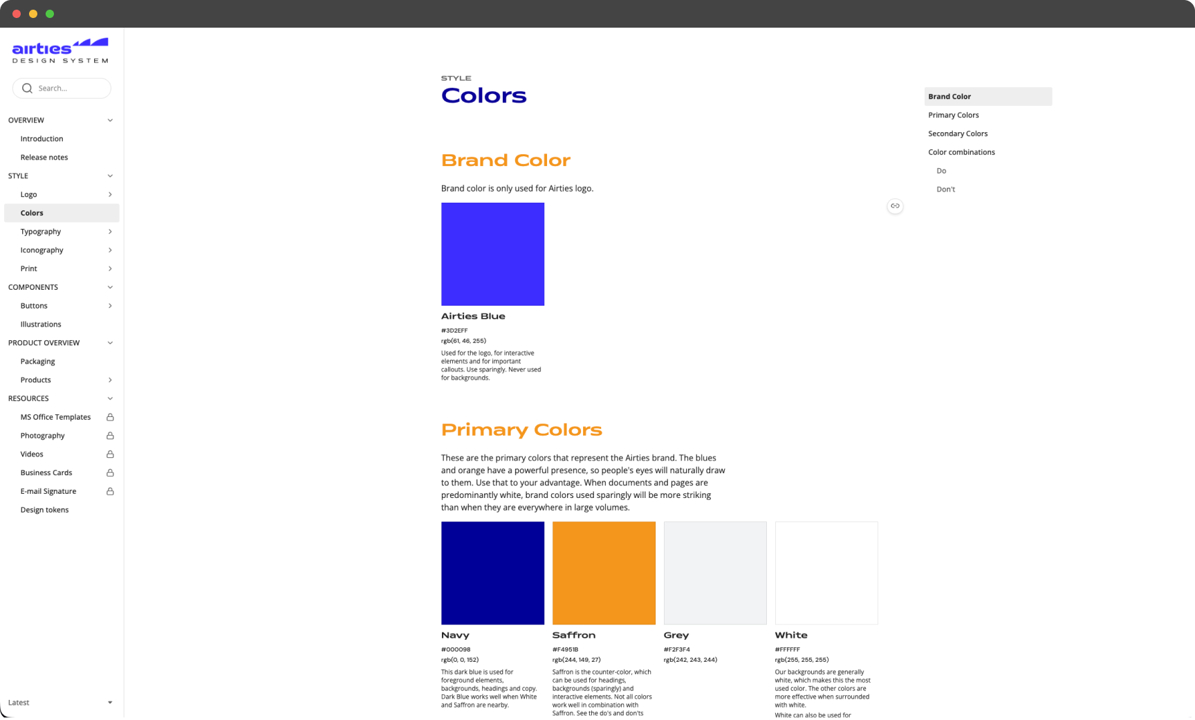
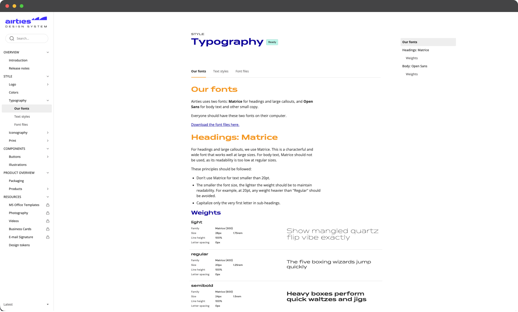
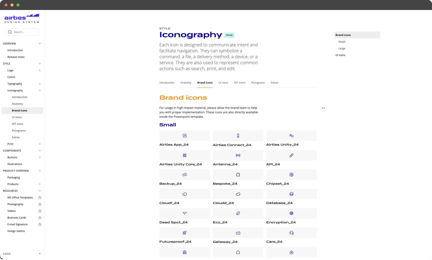
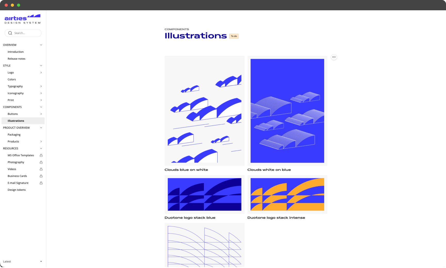
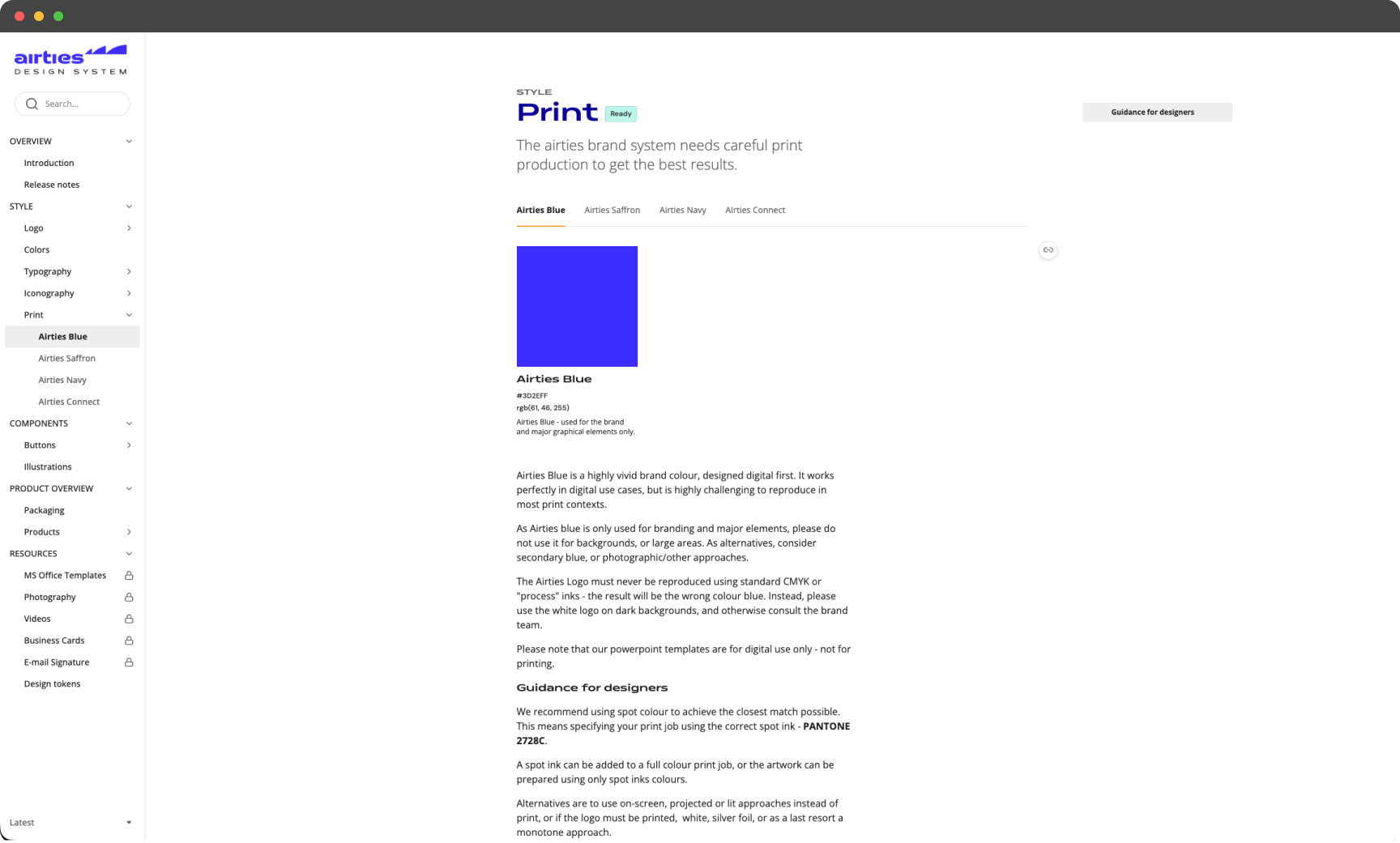
- Brand Guidelines: Developed comprehensive guidelines from scratch, integrating accessibility standards to ensure inclusivity.
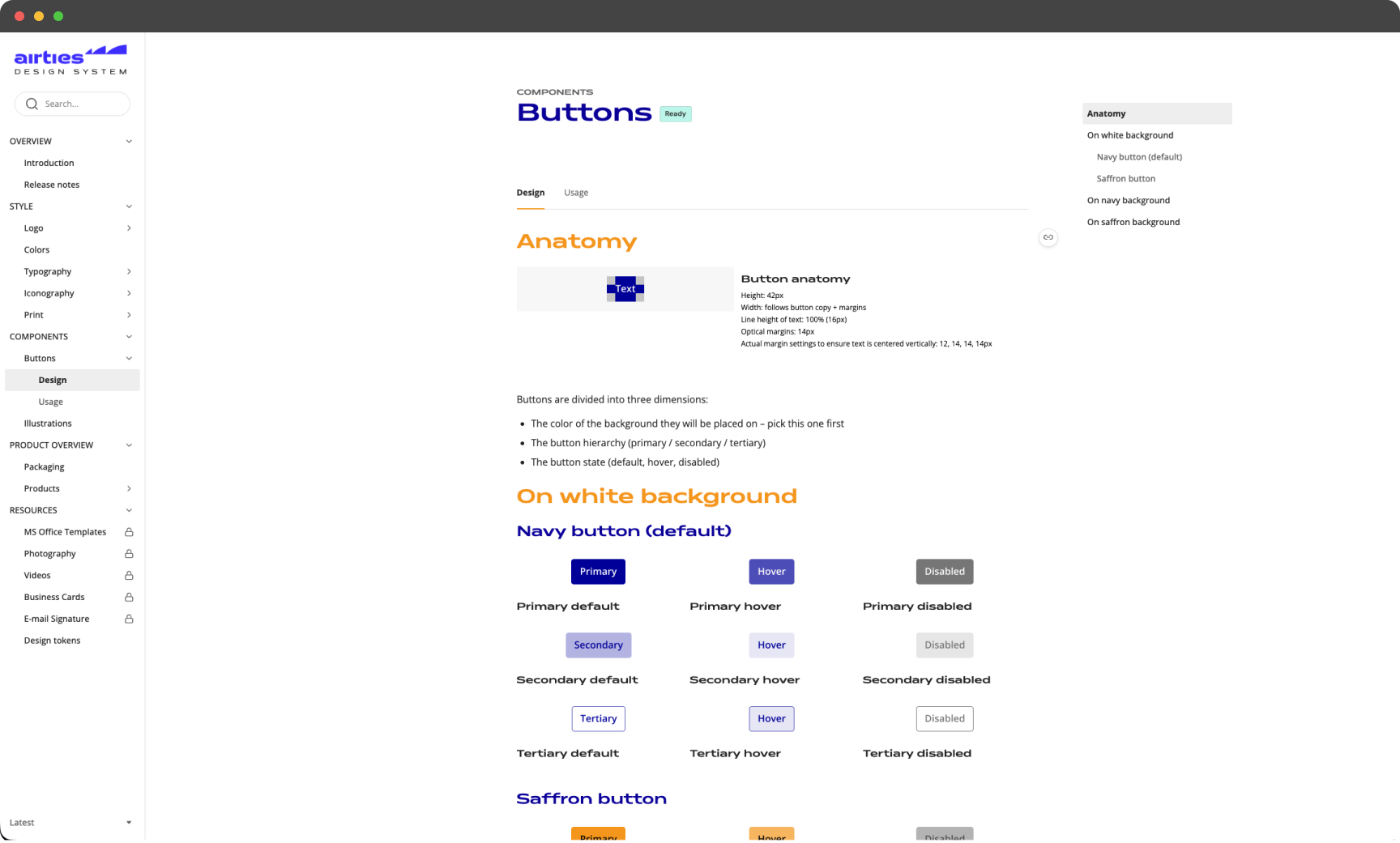
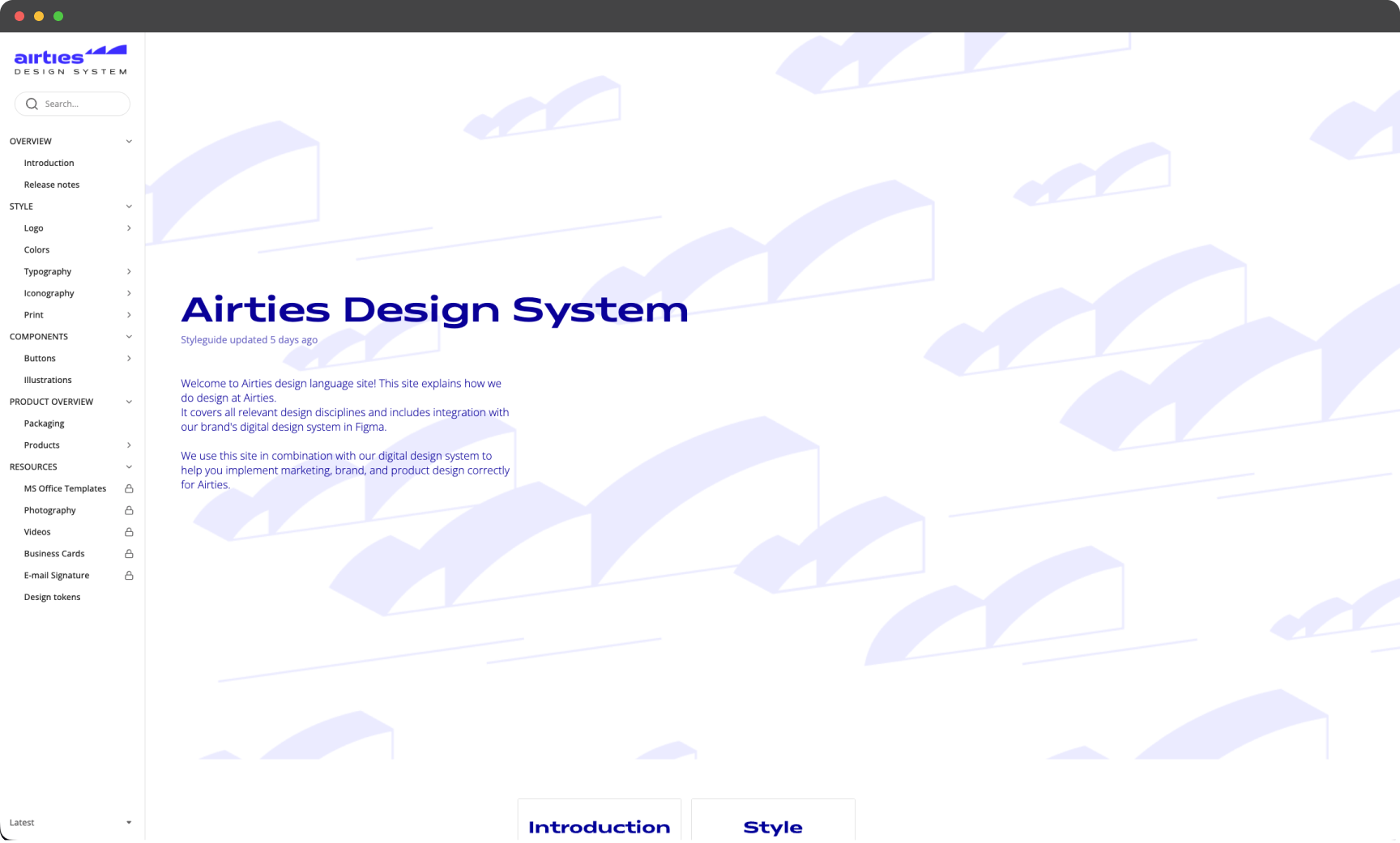
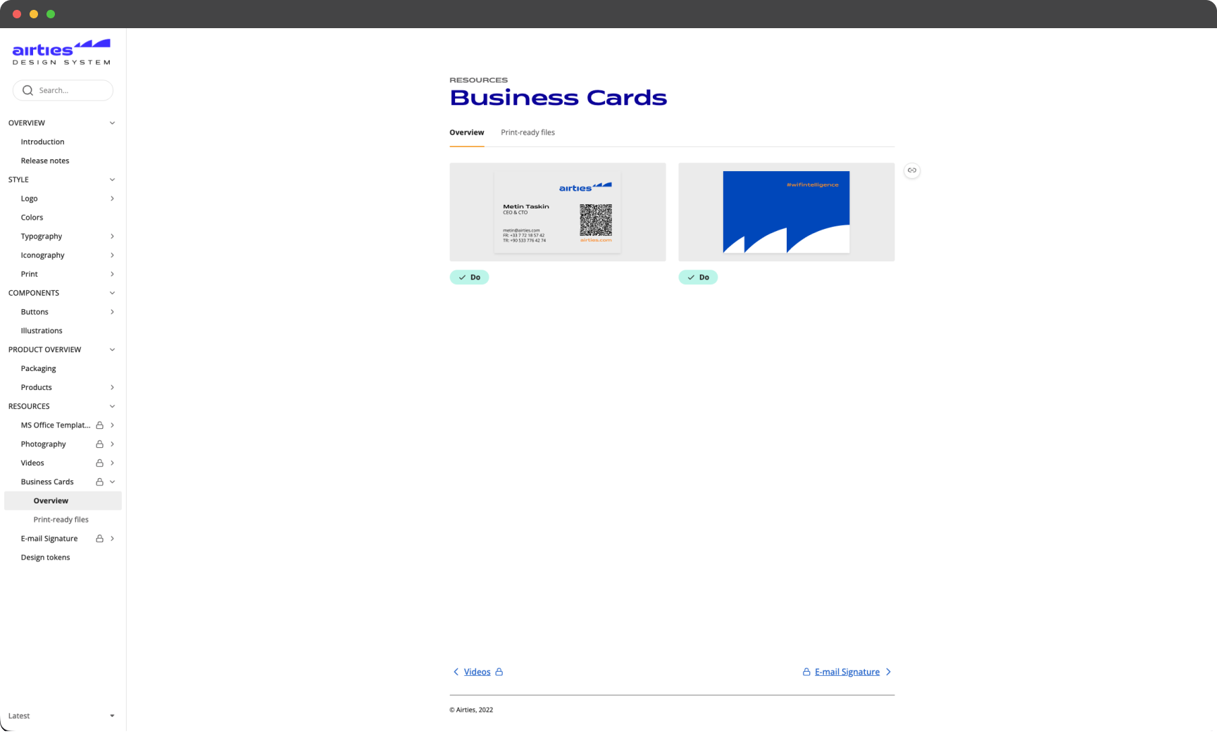
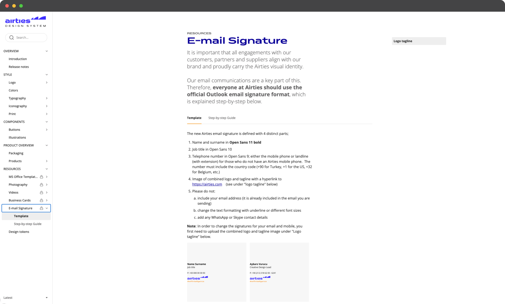
- Design System: Created specific documentation and a system for brand assets on design.airties.com.
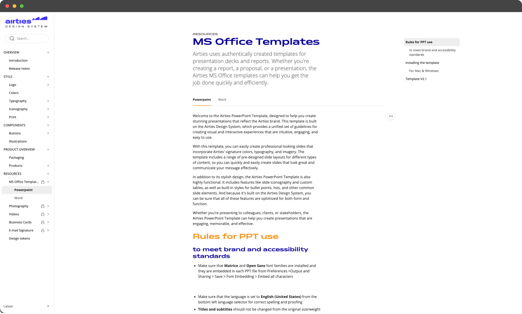
- Corporate Collateral: Designed robust templates for presentations, pitch decks, and reports to ensure consistency across teams.
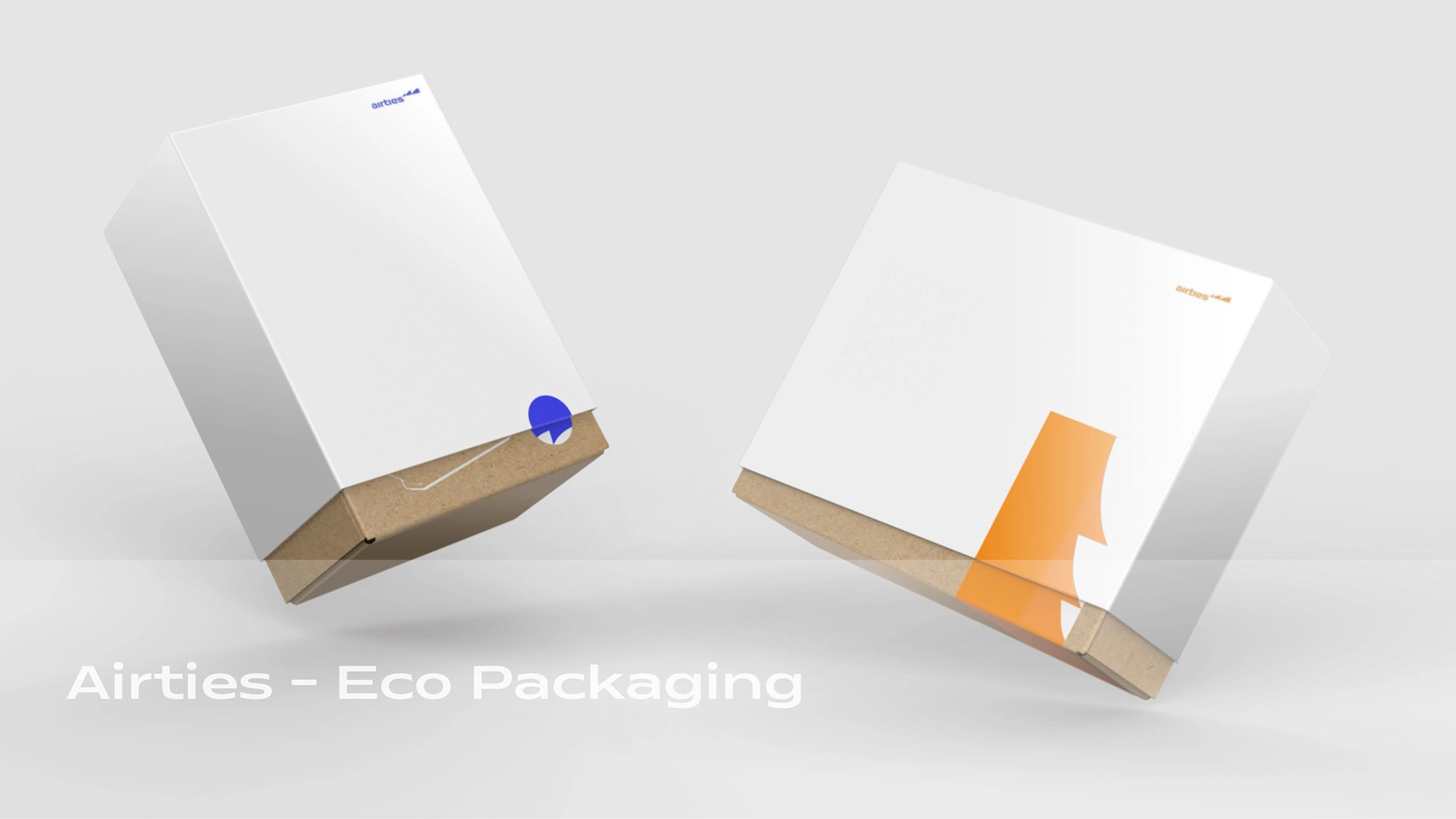
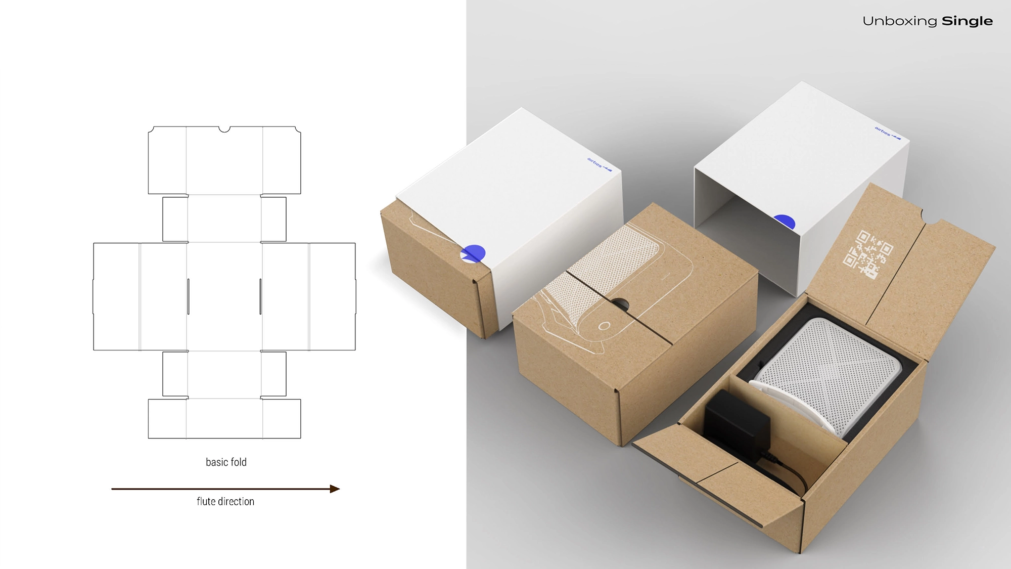
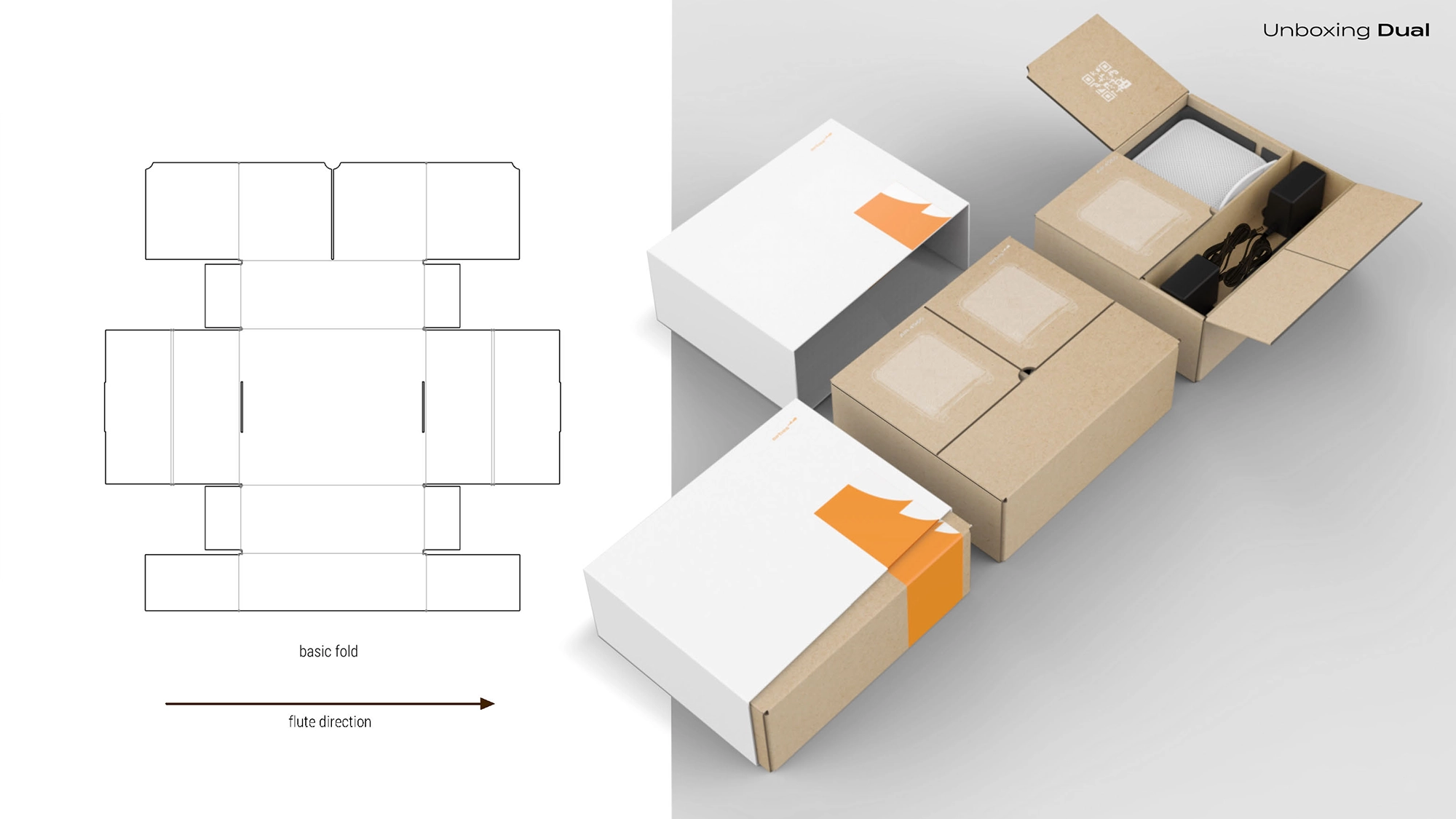
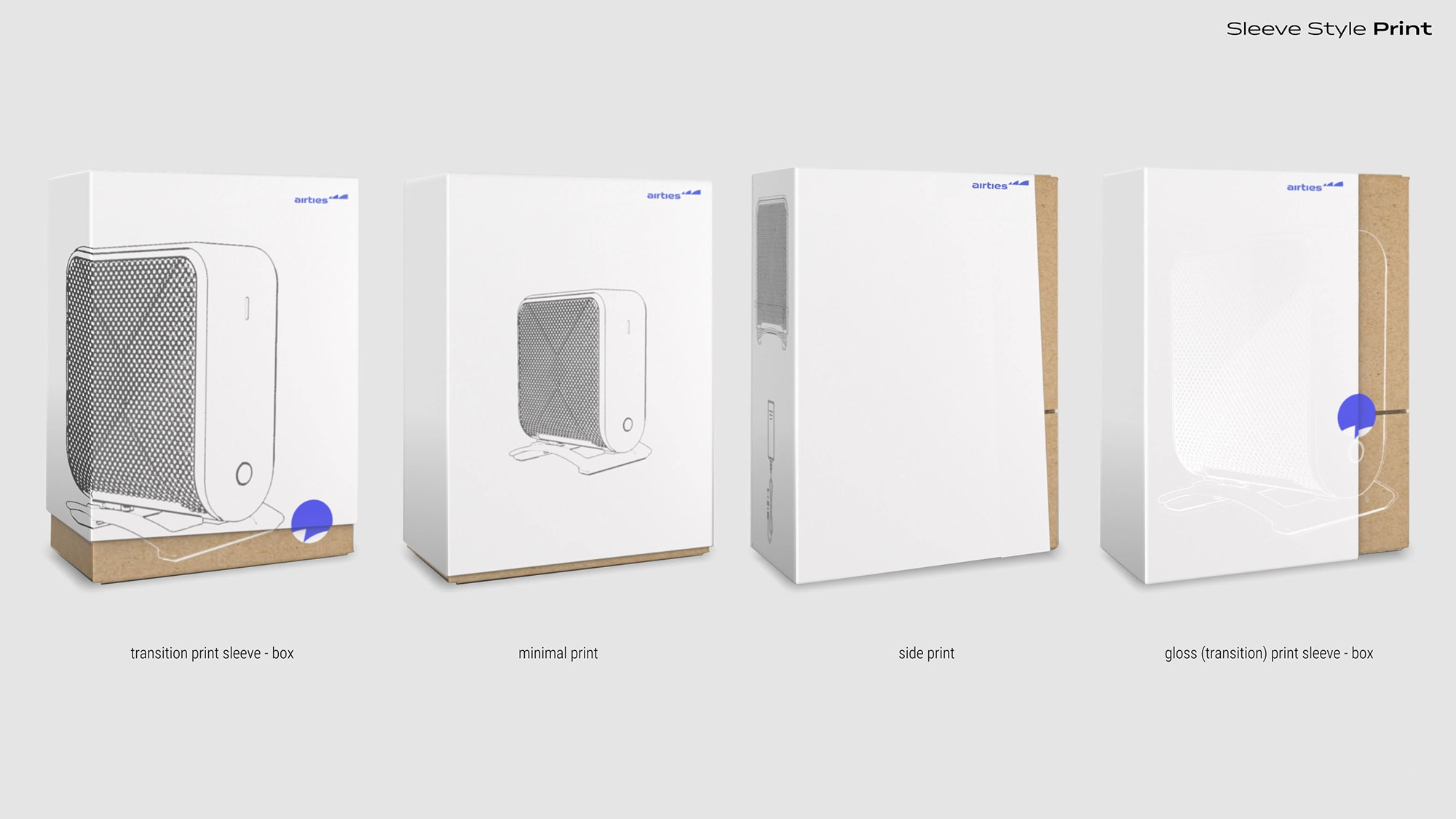
- Packaging: Designed new sustainable product packaging that aligned with the refreshed aesthetic.
- Marketing Assets: Redesigned all graphics, infographics, whitepapers, social posts, and print materials to reflect the new, systematical approach.
The result was a fresh, modern, and unified look that empowered the organization to communicate with confidence and consistency.
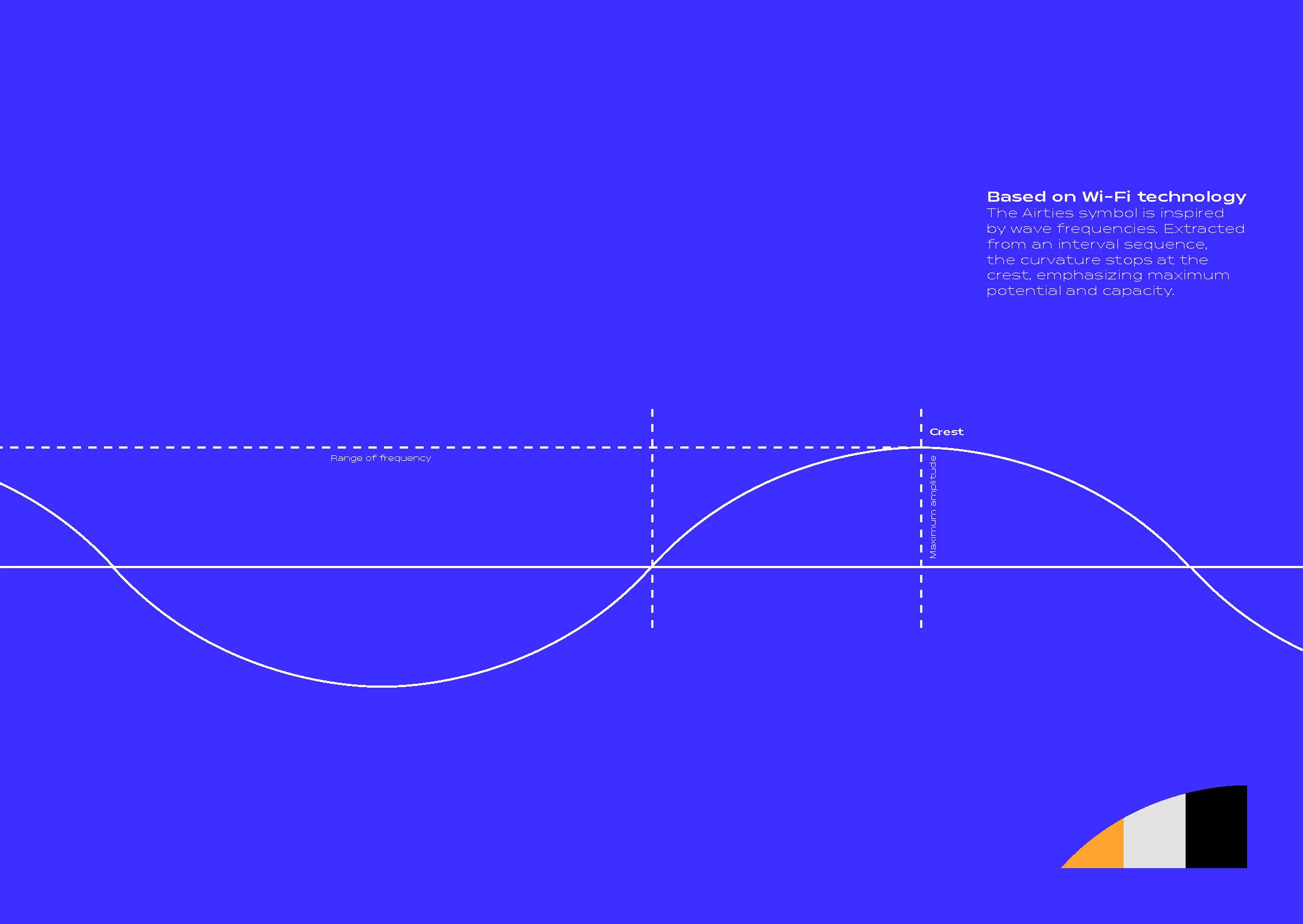
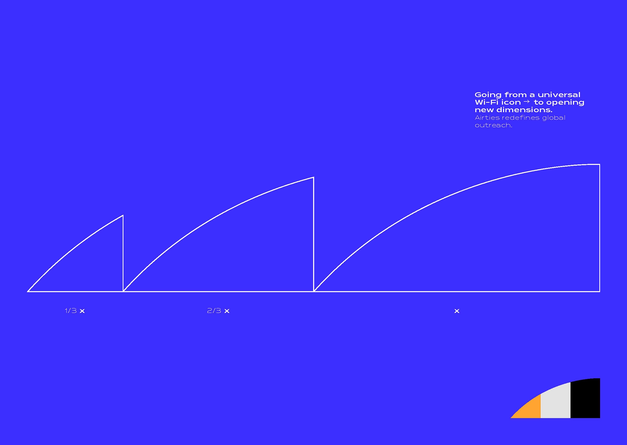
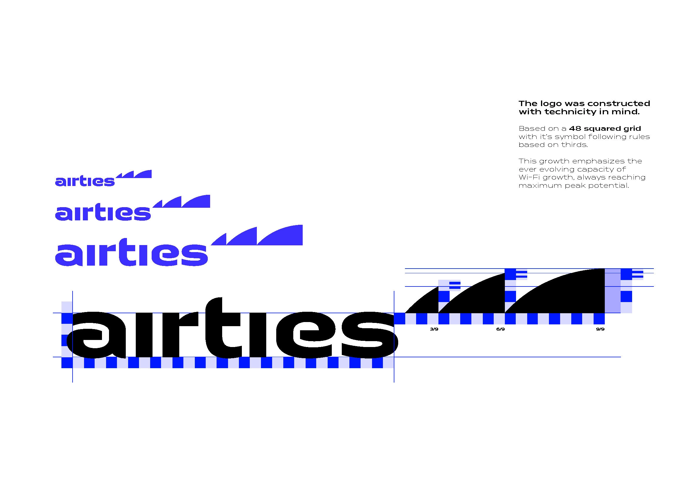
Key Visuals